Your onboarding launch is next week. HR still needs manager training. Compliance just changed a policy. Sales wants a refresher for a new objection pattern. Someone opens Premiere, stares at a blank timeline, and realizes the bottleneck isn't ideas. It's repeatable production.
That's why corporate video templates deserve more respect than they usually get. They aren't just a shortcut for design teams. They're an operating system for training teams that need to publish fast without rebuilding the same structure every time.
The problem is that most advice about corporate video templates stops at speed. Faster editing matters, but speed alone doesn't fix abandoned training. A polished video that employees stop halfway through is still a weak training asset. The stronger question is which template structures hold attention long enough for people to finish, apply, and remember.
Table of Contents
- Why Corporate Video Templates Deserve a Second Look
- The Anatomy of an Effective Corporate Video Template
Why Corporate Video Templates Deserve a Second Look
Corporate learning teams aren't experimenting with video anymore. Video was projected to account for 82 percent of all internet traffic by 2024, 85 percent of workers at large organizations were interacting with some form of video more than three times daily by the end of 2023, and employees were seventy-five percent more likely to watch a video than read documents or emails, according to Envato's summary of video consumption trends.
That changes the role of templates. They no longer sit in the "nice to have" category beside optional creative assets. They sit in the workflow with onboarding checklists, compliance rollouts, and internal comms calendars.
In practice, most L&D teams don't have a content problem. They have a production consistency problem. The script gets written, but every new video starts from scratch. One facilitator records a screen walkthrough one way. Another team builds slides. A third outsources editing. The learner experience becomes uneven fast.
> The template is rarely the finished product. It's the guardrail that keeps ten different contributors from producing ten different learning experiences.
A strong template reduces rework in the places that usually slow teams down:
- Opening structure: It removes the long branded intro nobody needs.
- Scene pacing: It gives each segment a built-in rhythm instead of guessing clip length during edit.
- Reuse: It lets trainers update policy text, screenshots, and narration without rebuilding layout logic.
- Scaling: It creates a standard that new authors can follow, especially when programs expand across departments.
Teams evaluating automated video production workflows usually discover the same thing. The technical act of generating a video isn't the hard part. The hard part is deciding what every training video should consistently contain so employees will complete it.
That is where templates earn their value. Not when they make a video look polished, but when they make a training library coherent.
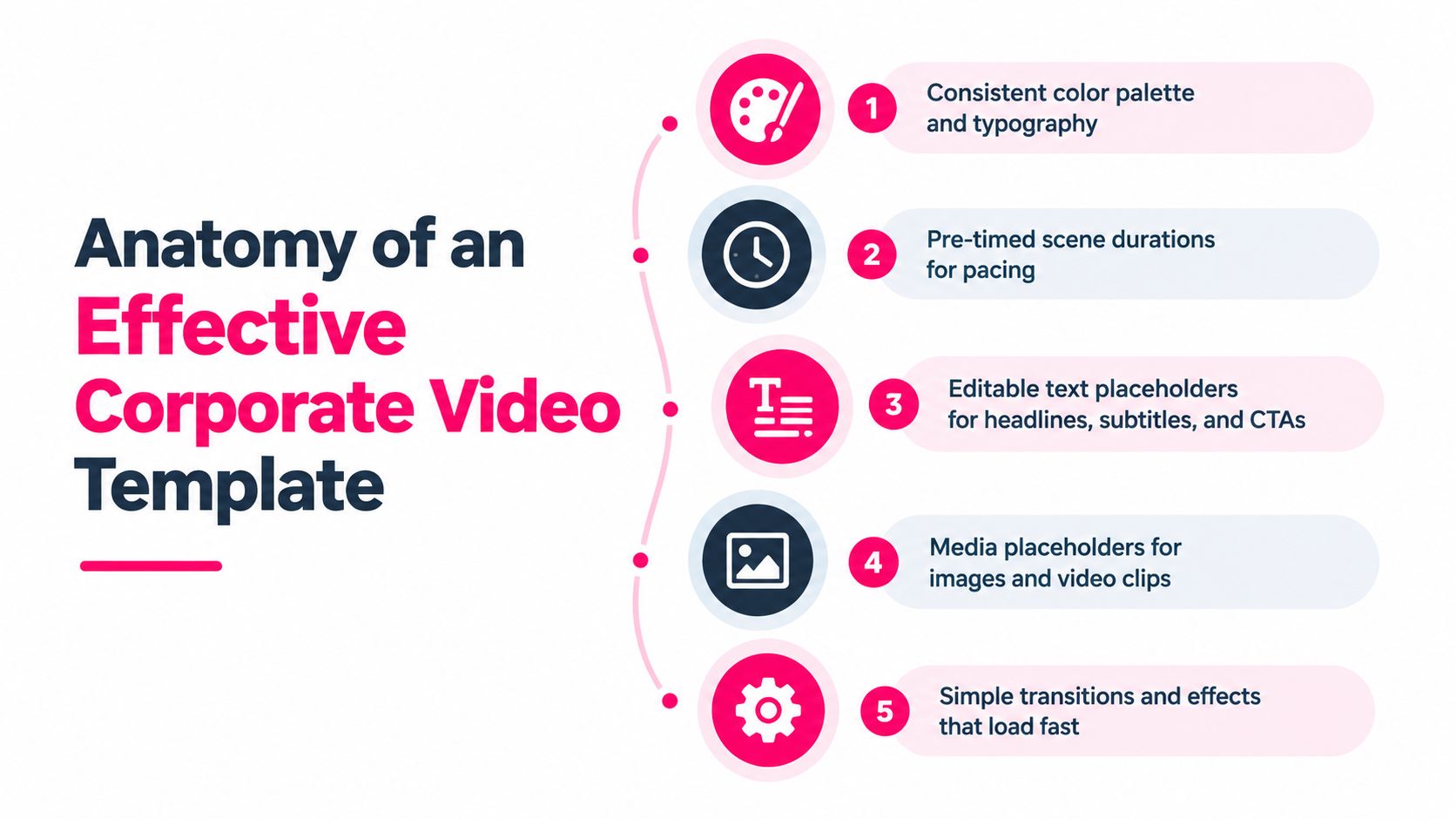
The Anatomy of an Effective Corporate Video Template
Most weak templates focus on visuals first. Effective ones are built around learner behavior. If a template doesn't support attention, comprehension, and next-step action, it won't matter how clean the typography looks.
Start with a task, not a welcome screen
The first screen should answer one question immediately. What will the viewer be able to do after this? The strongest templates open with the task, problem, or mistake being addressed.
A compliance video should say what decision the employee must make. A software training video should say what workflow they'll complete. A sales enablement video should say what objection they'll learn to handle. Generic "welcome to this training" openers waste the highest-attention moment in the whole asset.
Build around five structural parts
Every completion-friendly template I trust includes these components:
1. Hook: Name the situation or task right away. 2. Instruction block: State the learning objective in plain language. 3. Demonstration: Show the workflow, scenario, or conversation. 4. Knowledge check: Pause for recall before attention slips. 5. Call to action: Tell the learner exactly what to do next.
This structure matters more than animation style. It also works across formats, whether you're adapting a corporate training template for onboarding, a screen capture for systems training, or a policy update with voiceover and slides.
> Practical rule: If a template can't naturally accommodate a task statement, a demonstration, and a check for understanding, it's probably a promo template wearing training clothes.
Pace for completion, not for comprehensiveness
Independent industry summaries report that videos under four minutes consistently outperform longer formats, with completion commonly around seventy-five to ninety percent for short clips compared to under thirty to forty percent for videos above ten to twenty minutes. That doesn't mean every topic is simple. It means your template should assume modular delivery.
A better production pattern looks like this:
| Template element | What works | What usually fails | |---|---|---| | Opening | Immediate task statement | Long logo animation | | Scope | One skill or decision | Multiple objectives in one video | | Demo | Real scenario or screen path | Abstract narration without context | | Interaction | Short check after a segment | Passive viewing from start to end | | Finish | One next action | Vague "thanks for watching" ending |
Audio also affects completion more than many teams admit. When narration is hard to hear or background music competes with instruction, drop-off rises quickly. If you're refining a voiceover-heavy module, a simple utility to add soundtrack to footage can help balance narration with supporting audio instead of forcing learners to work through muddy sound.
The best template is not the one with the most editable layers. It's the one that makes the right learning choices easy.
Matching Template Types to Your Training Use Case
Template libraries are massive now. Canva lists 872 training video templates and Adobe Express lists 1,372 business video templates, a sign that template-based production has become a mainstream business workflow rather than a niche design activity, as noted in this market snapshot.
That abundance creates a new problem. Teams confuse choice with fit.
A template that works for new-hire orientation can fail badly in compliance. A slick brand-forward opener might suit customer education but waste time in just-in-time field training. The decision should start with use case, not aesthetics.
A quick example helps frame the difference:
Onboarding needs reassurance and clarity
Onboarding templates work best when they feel guided but not slow. New hires need enough warmth to understand company culture, but they also need practical orientation they can use immediately.
What I look for in onboarding templates:
- Visible sequence: New employees should see where this module fits in the larger journey.
- Simple screen density: Too much text on day one creates friction.
- Immediate relevance: "Here's how to access payroll" beats "Here's our philosophy" when someone is still setting up accounts.
A good onboarding template usually supports walkthroughs, introductions, and quick task demos in separate modules, not one giant welcome video.
Compliance needs precision over personality
Compliance videos often fail because teams try to make them cinematic. That's the wrong objective. The right objective is correct action under pressure.
The strongest compliance templates do a few things well:
- Task framing: They state the policy decision or required behavior upfront.
- Error callouts: They show common mistakes clearly, not subtly.
- Decision moments: They pause for a question or short check before moving on.
> If the learner finishes a compliance video but still can't recognize the risky choice in context, the template did its job visually and failed operationally.
Sales enablement needs speed and repeatability
Sales templates should assume interruption. Reps watch between calls, before demos, or during pipeline reviews. That means the best sales formats are short, pattern-based, and easy to revisit.
The useful structures here are objection-response clips, product positioning snapshots, competitor talk-track refreshers, and scenario role-play recaps. Long polished explainers don't match the way sales teams consume internal learning.
Customer education needs self-service clarity
Customer education sits in a different lane. Here, the template needs to carry brand credibility without slowing down the answer. Good customer-facing training often relies on:
| Use case | Strong template pattern | Common mistake | |---|---|---| | Onboarding | Guided sequence with short task demos | One long orientation video | | Compliance | Decision-focused scenario format | Brand-heavy intro and vague messaging | | Sales enablement | Repeatable micro-modules | Dense feature lecture | | Customer education | Visual how-to with clear next step | Overproduced narrative before instruction |
The practical filter is simple. Ask what action must happen after the video, how quickly the viewer needs that answer, and what mistakes the video must prevent. Those answers narrow the template choice fast.
Customizing Templates for Brand Consistency and Accessibility
A common failure shows up late. The pilot video looks polished, the stakeholders approve it, and by module three the series feels inconsistent, harder to update, and awkward on mobile. Completion drops because learners have to work around the format instead of focusing on the lesson.
Customization decides whether a template stays usable at scale. The goal is not to make every video look branded. The goal is to make every module feel familiar, readable, and easy to follow so employees can spend attention on the decision or task being taught.
!Screenshot from https://www.videolearningai.com
Lock the brand basics early
Strong templates remove routine design choices before production starts. That means setting the heading and body styles, defining how accent colors are used, limiting logo placement, and deciding what tone fits the subject matter.
Training teams often over-brand intros and under-design the teaching moments. A persistent logo, animated bumper, and full brand palette may satisfy reviewers, but they also consume space, time, and attention. In internal learning, quiet consistency beats constant visual signaling.
Use the template to standardize the parts authors tend to improvise badly:
- Typography: One heading style and one body style that stay readable on laptop and phone screens.
- Color use: Accent colors should mark warnings, key actions, or choices, not decorate every frame.
- Logo placement: Keep it small and predictable.
- Voice and tone: Match the message. Policy training should sound clear and calm, not promotional.
That discipline helps retention. Learners stop decoding format changes and start recognizing the instructional pattern.
Script to the template
Teams lose time when they write a full document first and force it into video later. The result is familiar. Crowded screens, narration that outruns the visuals, and editors adding motion to hide structural gaps.
Write in scenes. Each scene should do one job and support one learner action.
A practical scripting pattern:
1. Scene goal: What must the learner understand or decide here? 2. Visual cue: What needs to appear on screen to support that point? 3. Narration: What can be said in plain language without duplicating the screen text? 4. Learner action: Is the learner watching a step, making a judgment, or answering a prompt? 5. Timing check: Does the scene still fit the pace of the module?
This is also where tool choice matters. Camtasia, Synthesia, VEED, and VideoLearningAI support different parts of the workflow, from screen capture to AI-generated presenters to lightweight editing. The useful filter is simple. Choose the option that makes short, structured modules easier to produce and revise.
> Good customization reduces learner effort. Bad customization increases production effort and still leaves the learner with more work.
Storyboard before recording
I rarely see long raw recordings get shorter once they exist. Subject matter experts become attached to what they said, even when the template calls for a tighter sequence.
A storyboard solves that problem early. It shows whether the layout can carry the message, whether captions will collide with screen elements, and whether the pacing leaves room for reflection or a knowledge check. Even rough frames are enough to catch bloated sections before anyone records narration or captures a walkthrough.
Build accessibility into the template, not the cleanup pass
Accessibility works best as a template rule set. If teams add it at the end, they usually patch captions onto crowded screens and call it done.
Start with layout decisions. Leave safe space for captions. Keep contrast high enough for text overlays to remain readable. Avoid putting meaning in color alone. If a visual change matters, the narration or on-screen text should state it clearly.
A few choices have an outsized effect:
| Do | Don't | |---|---| | Leave safe space for captions | Put critical text against the bottom edge | | Use high-contrast text overlays | Use brand colors that weaken readability | | Keep one idea per screen | Fill screens with paragraphs | | State visual meaning in narration | Assume motion alone explains the point |
The cleanest templates usually teach better. They give instructions room to breathe, keep the interface predictable, and reduce the small frictions that make employees stop watching before the lesson lands.
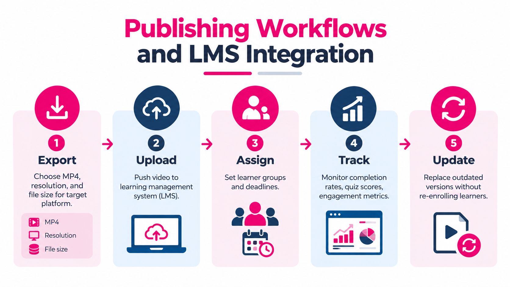
Publishing Workflows and LMS Integration
A finished MP4 isn't a publishing strategy. If the video can't be assigned, tracked, updated, and found when employees need it, the template has only solved the first half of the problem.
The stronger workflow treats corporate video templates as part of a delivery system. That includes export settings, packaging choices, metadata, version control, and LMS behavior.
Choose the delivery format based on what must be tracked
Not every training video needs the same wrapper. Some assets work as direct embeds inside a knowledge base. Others need SCORM packaging because completion status, quiz score, or sequencing matters. For richer event-level tracking, some teams move toward xAPI.
The wrong move is treating every video as a standalone file and figuring out reporting later.
A practical matching approach looks like this:
- Simple internal updates: Use direct embeds or LMS video objects when tracking needs are light.
- Required completion training: Package in SCORM when you need standard completion logic.
- Behavior-rich tracking: Consider xAPI when your environment supports more detailed activity data.
Teams planning learning management system integration should map these decisions before production starts, not at rollout.
Design templates for just-in-time access
Employees expect just-in-time learning, and microlearning works best when content is broken into short modules with knowledge checks. Training videos are most effective when they clearly state the task, show the situation, call out common mistakes, and end with a knowledge check or next action, according to this corporate training production guidance.
That has direct implications for template design inside the LMS. If a field technician, branch manager, or call center rep needs one answer fast, your publishing structure should let them reach that exact module without scrubbing through a long course shell.
> A searchable library of small, well-labeled modules usually outperforms a polished course that hides the answer three chapters deep.
Test the learner journey before launch
The technical checks are boring. They're also where preventable failures happen.
Before rollout, test:
1. Enrollment and assignment logic 2. Completion tracking 3. Quiz submission behavior 4. Mobile playback 5. Version replacement process
This matters most in compliance-heavy environments, where outdated modules can linger in an LMS long after a policy changes. A good template system makes updates easy because the structure is already approved. Teams replace screenshots, swap narration, revise a check, and republish without rebuilding the module from the ground up.
Publishing discipline turns templates from assets into infrastructure.
Measuring Performance and Driving Retention
Measuring the easiest thing first is a common starting point. They count how many videos were produced, how quickly they were published, or whether the look and feel stayed on brand. Those metrics tell you almost nothing about learning impact.
What matters is whether the structure of the video helped people retain and apply the content.
Completion is a design signal
A peer-reviewed study on short video access found the experimental group achieved significantly higher delayed practical performance and procedural knowledge with fewer errors and faster completion time. The same research summary notes that microlearning is repeatedly associated with twenty-five to sixty percent better retention, and one summary cites one hundred forty-five percent more retained information after two weeks and one hundred fifty percent stronger recall after six months for repeated short exposures, as described in this research-linked overview.
That doesn't mean every short video is good. It means short, well-structured, repeatedly accessible training has a stronger chance of working than long passive viewing.
The measurement implication is straightforward. If employees routinely stop at the same point in a module, the issue usually sits in structure, pacing, or relevance. It is rarely fixed by adding more branding.
Track the metrics that lead to action
In an LMS or learning analytics environment, the most useful signals tend to be:
- Completion patterns: Where do learners stop?
- Knowledge check performance: Which concepts are not landing?
- Rewatch behavior: Which modules are being revisited before action?
- Time to proficiency: How quickly can someone perform the task after training?
A low-performing module often reveals one of three template problems. It covers too many ideas at once. It delays the practical demonstration. Or it treats the learner as a viewer instead of asking for a decision.
Iterate at the template level
Many teams revise scripts but never revise template logic. That's a missed opportunity.
If one onboarding module consistently holds attention and another drops off, compare structure before content. Did the strong one open with a clear task? Did it show the system sooner? Did it ask the learner to do something before the ending? Those answers are more valuable than subjective feedback like "make it feel punchier."
> Retention improves when teams stop treating templates as design files and start treating them as hypotheses about learner behavior.
Once you start measuring that way, your library gets smarter. You don't just create more videos. You create better defaults.
Building Your Template Library for Scale
A team usually feels the pain of scale at the same moment. Five authors are building training at once, two versions of the same template are circulating, legal approved an older cut, and nobody is sure which file is the current standard. At that point, the problem is no longer design quality. It is library governance.
The libraries that hold up under volume are usually simple. They are built around repeatable training jobs, clear ownership, and retirement rules that keep weak templates from lingering for years. I group templates first by training use case, then by format, then by business unit only if local variation is needed. That prevents the common sprawl where every department asks for its own version of a template that should have stayed shared.
A practical structure looks like this:
- Onboarding
- Compliance
- Sales enablement
- Customer education
Inside each template file, set a naming rule people can follow without a cheat sheet: [UseCase]_[TemplateType]_[Version]_[Owner]. For example: Compliance_ScenarioDecision_V3_LDTeam. Add one line of metadata in the file or project description with the approval owner, last review date, target runtime, and intended LMS destination. Small admin details like that save hours once the library passes a dozen active templates.
Status labels matter too. Use four, not ten: Draft, Approved, Restricted, Retired. "Restricted" is useful for templates that are structurally sound but tied to a policy, product line, or region. Without that middle state, teams either overuse a template that should stay limited or retire assets that still have a narrow job.
Retirement criteria should be explicit. Archive a template when branding has changed enough to require rework, when a system interface shown on screen is outdated, when completion drops compared with newer templates serving the same purpose, or when authors keep bypassing it because production takes too long for the learning value it delivers. If a template has not been used in two review cycles, that is usually a sign to remove it from the active library.
A template library should reduce decision fatigue for authors and reduce friction for reviewers.
If you're building corporate video templates for onboarding, compliance, sales enablement, or customer education, VideoLearningAI gives teams a way to turn source material into short, structured training videos without heavy editing overhead. It supports the kind of template-driven, microlearning workflow covered here, from creation through LMS-ready publishing. Explore VideoLearningAI to see how that workflow can fit your training stack.